Given by Haroen Viaene, 21 September 2016 for FreeCodeCamp Ghent
inspired by Tracy Osborn
Given by Haroen Viaene, 21 September 2016 for FreeCodeCamp Ghent
inspired by Tracy Osborn
Clutter is something which is the reason of most designs that can be improved

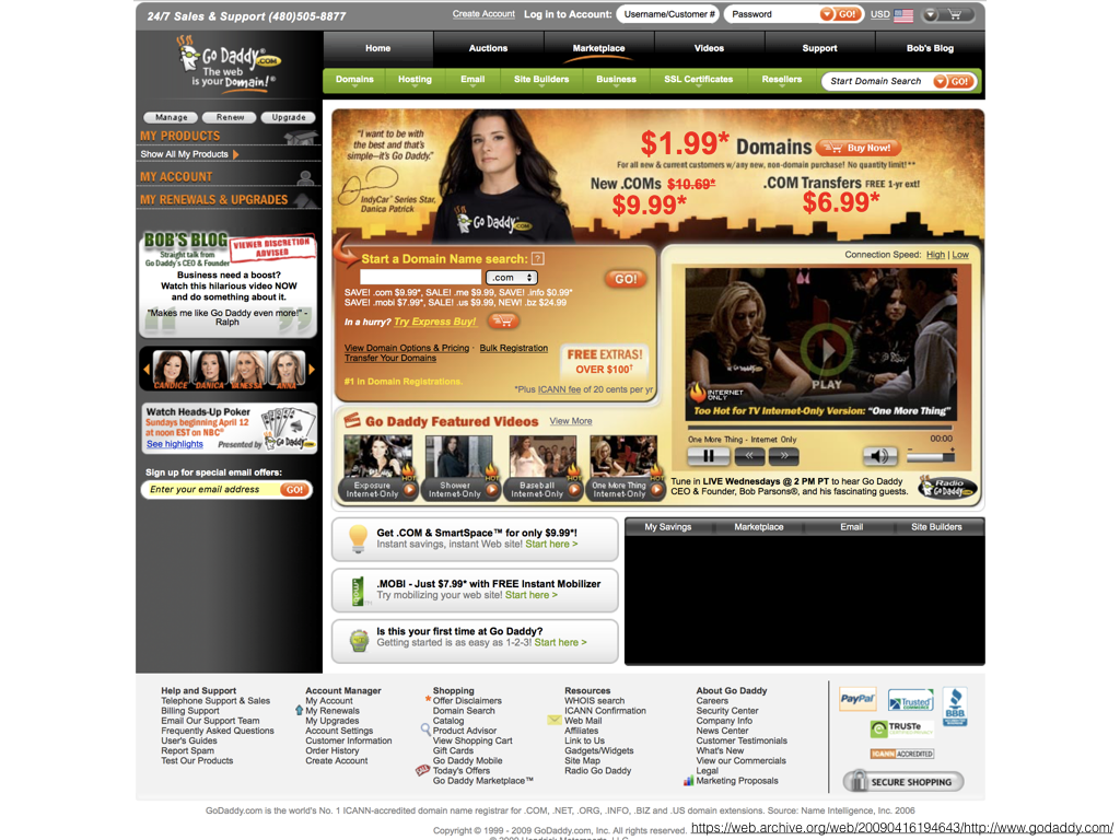
Let’s take a look at this bad design and try to improve it.
First improvement, the grid and alignment
let’s turn this thing
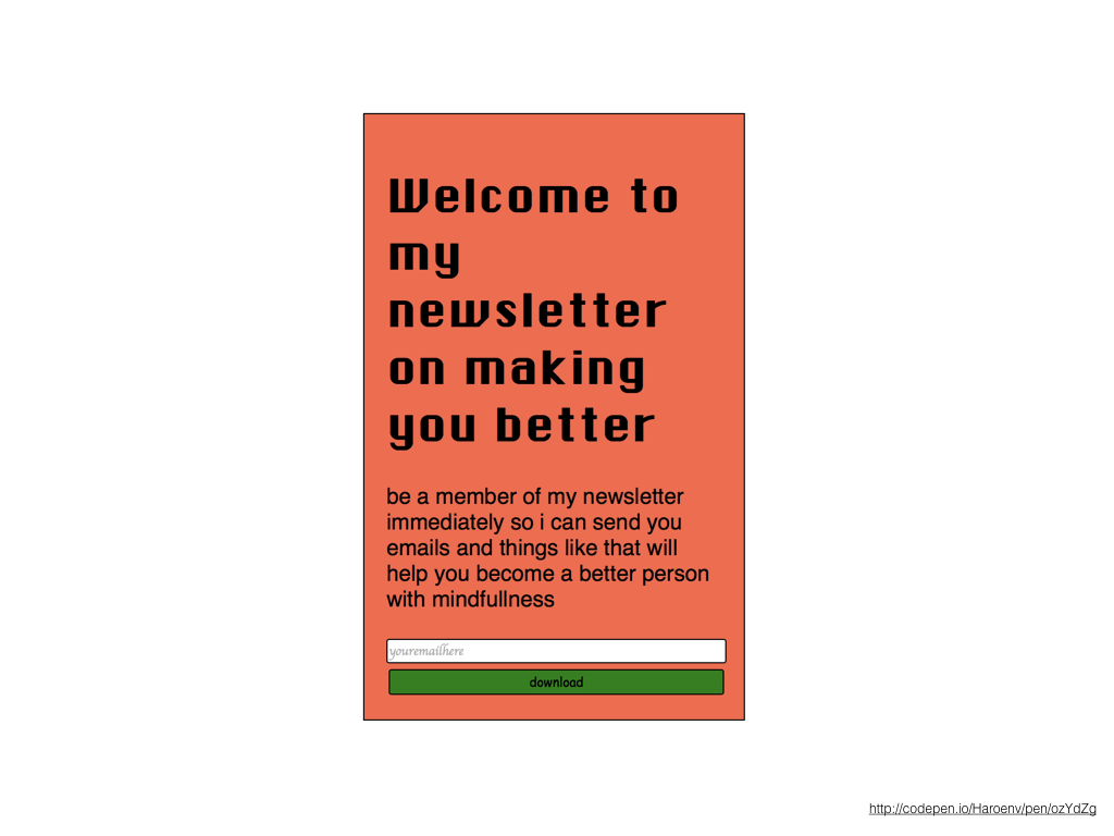
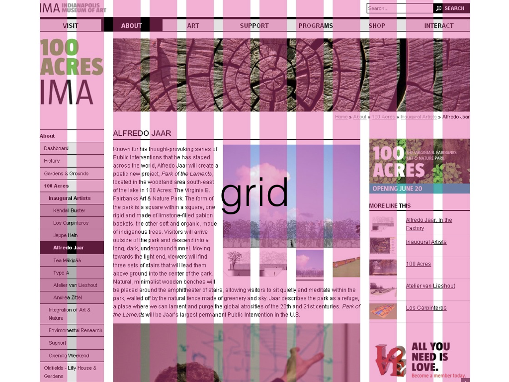
into this thing, where we have even spacing, and generous margins
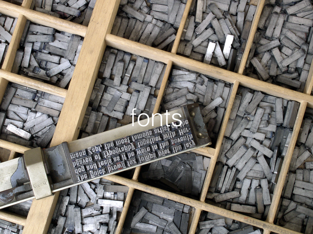
fonts are fun, use them!
But use them sparingly. Use just one or two of them, and try to stick to system fonts as much as possible to avoid FOIT and FOUT

So this will turn into
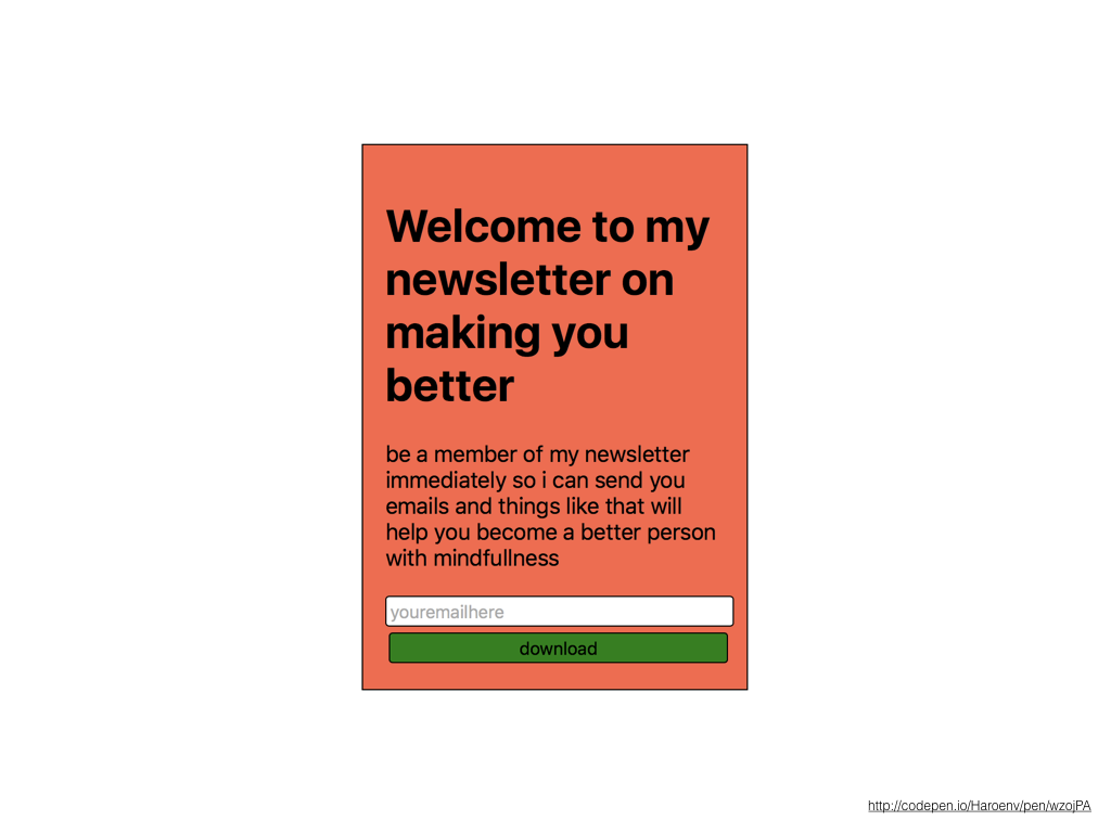
this, where we only use system fonts (in this case San Francisco, with fallbacks for other environments, like Roboto …)
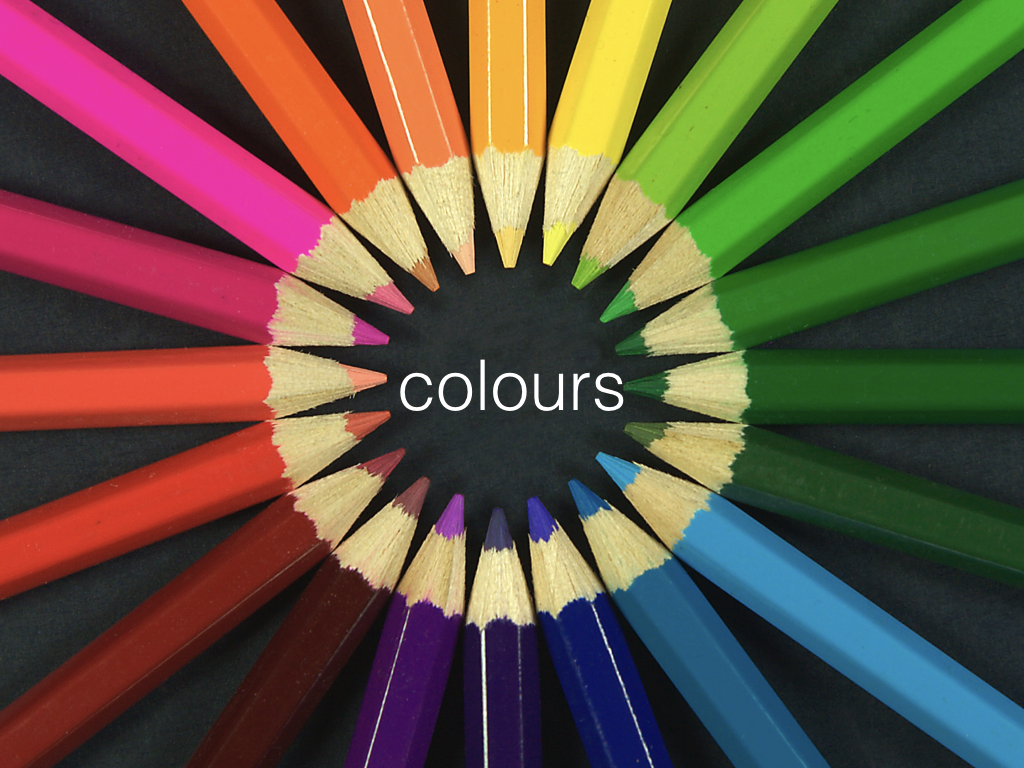
don’t you all love colours? I do, but these tools
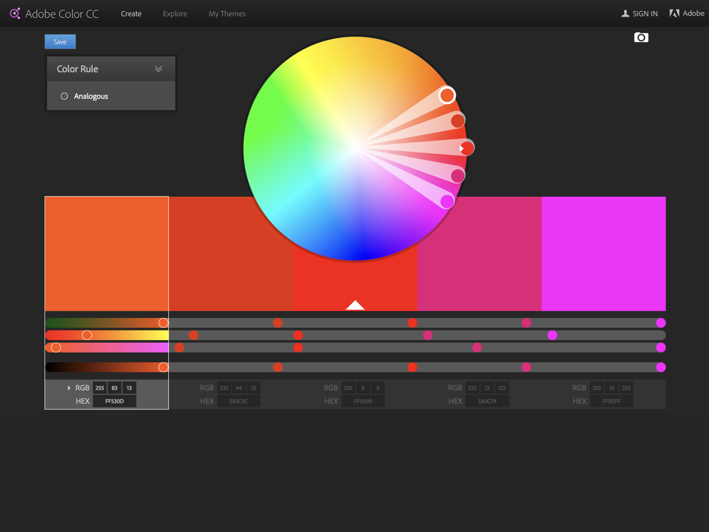
They’re so incredibly hard 😔
I can only make bad combinations with them somehow
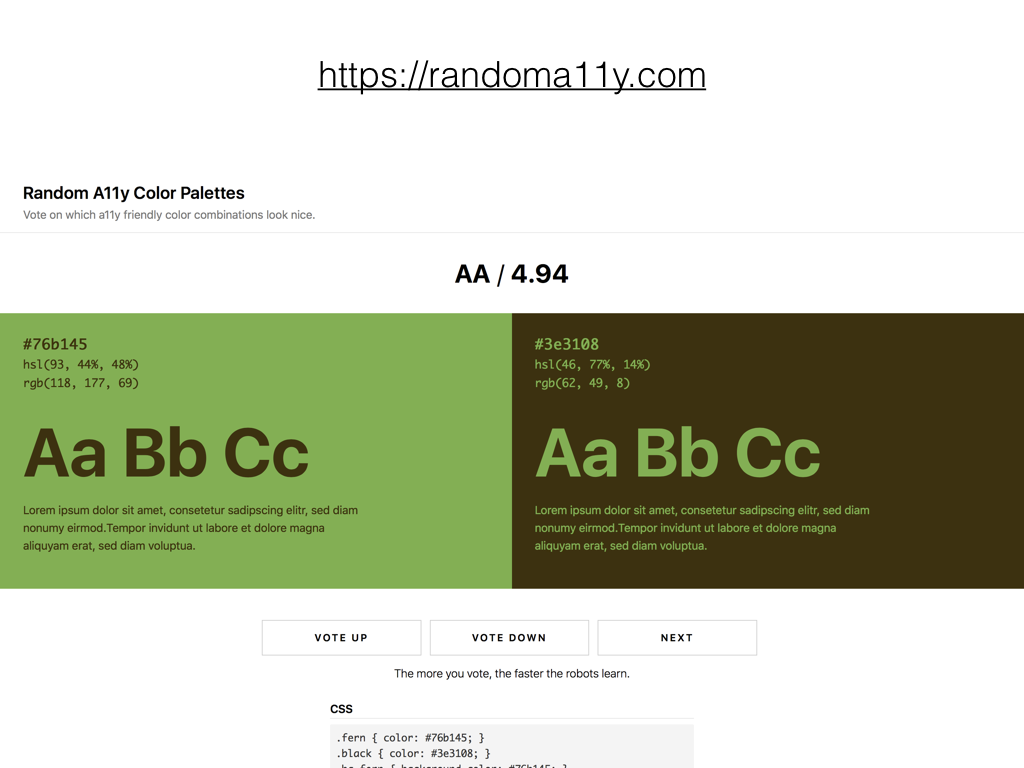
But look at https://randoma11y.com, great fitting colour combinations for free

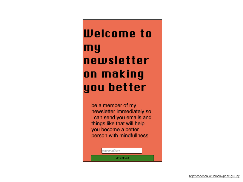
Let’s use less colours here

One colour is enough accent, so the buttons actually stand out!
copy is the most important part of a site, the design is supposed to support the actual content on the site
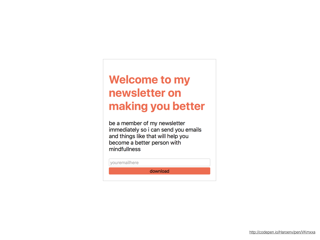
Let’s make this make more sense
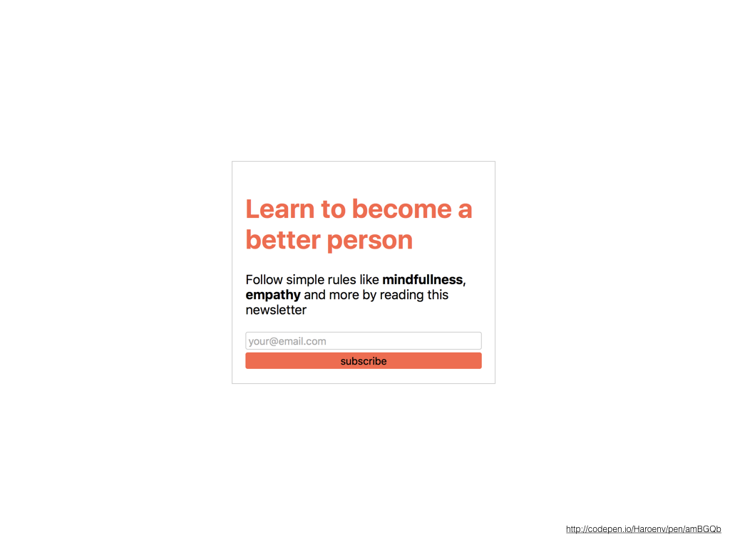
Shorter sentences, <strong> for emphasis
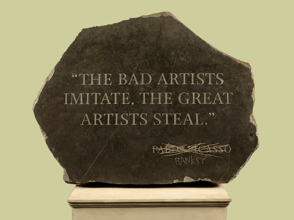
Don’t try to reinvent the wheel all the time, look at other people
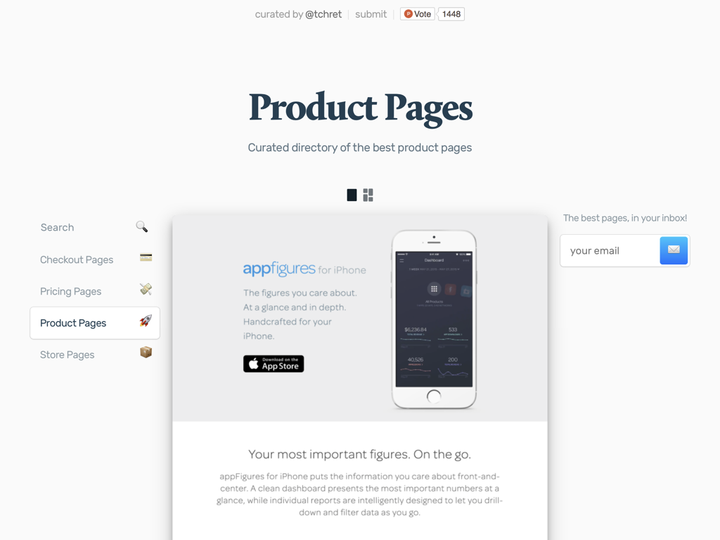
Like for example on productpages.xyz by Thomas Chrétien
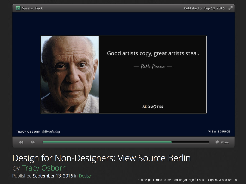
Even this page isn’t invented by myself, it was mostly inspired/rehashed content by Tracy Osborn, when I saw her speak at View Source 2016 in Berlin.
You can find this talk at haroen.me/presentations